Augmented Reality Browsers Innovation & Best Practices
Not so long ago I was an evangelist championing the adoption of distance voice recognition technologies in the UK. Love them or hate them I’m sure you’ll have experienced them.
IVR: “Welcome to your local cinema please speak the name of the movie you would like to see”
YOU: “Avatar”
IVR: “You said Valentine’s Day, is that correct?”
YOU: “no I said Avatar”
IVR: “Thank you what time would you like to see Valentines Day”
YOU: “I don’t want to see Valentines Day I want to watch Avatar”
IVR: “You said 5 am is that correct”
and it goes on.
During my speech technology years, I learned that when you move away from the visual it’s actually very difficult to build a UI that presents the user with lots of information. Try this, look at your desk and imagine you want to allow a user to choose anything they see lying around. You are probably thinking easy I’d put everything into a list and let the user select what they want. Good answer, but what happens if the user is in another room and they can’t see your list? Now you have the challenge of having to tell them each item that is on the desk, since you have no idea what they are likely to need you don’t really know which items to list first. With an IVR you have the added complications of having only 10 keys so if you have a lot of items lying around then you’ll need to split them up into pages. Press * for more options. Coupled with trying to present all the information at a reasonable speed without boring the user and having them screaming into the phone you can see some of the complications.
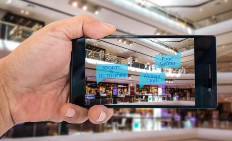
Why is this relevant to augmented reality? Augmented reality developers have to address similar problems but instead of working with the challenge of no visual UI they have a problem of visual overload and face issues such as:
How do you present a large amount of data to users in a visually compelling way?
- How do you show data that may be located in almost the same geographic location and decide which object should be in front?
- How can you make it easy for users to navigate the results without obscuring objects in the background?
- How do you provide some way to indicate distance so users get some indication of scale?
It’s an interesting problem that as users we don’t think twice about
Here is a typical search (Wikitude) which shows the closest items first and those further behind.

Notice that they are all plotted on the same plane making it difficult to get access to some of the background items, which could of course be the result you are after. We do get the impression of depth because the distant objects are represented by smaller icons.
Working/Acrossair hit upon the idea of stacking results. Those results that are nearest to your location are shown at the bottom and as you move your way up the list they get a further away.

Acrossair stacking results
As more browsers are released and browsers go through new releases it’s interesting to see how developers are approaching the issue of distance and presenting data. For that, I am going to draw attention to 3 browsers that have notable innovation worthy of being called ‘best practices’ for augmented reality browsers of the future.
Yell
Yell recently released its AR browser, it’s very Wikitude like in that all items are plotted on the same plane so it does suffer from POIs being hidden when there is a large group of results in the same area. Yell has attempted to solve this with its automatic lock-on functionality. As you move the phone around the targeting reticle will lock onto a POI saving you trying to hold the phone still and tap a partially obscured result. A pretty neat innovation.
Yell with automatic target lock-on
Wheremark
Wheremark is worthy of an innovation mention for their feature which allows you to pinch the screen to change the range. Instead of having to select distance through a menu or via a slider, you can re-size the distance in the same way you re-size a webpage. Search results are stacked and the further away the POI is from your current location the smaller it will appear.
Wheremark stacking with pinch distance control
Zagat To Go
Zagat To Go a new browser from Handmark has probably one of the most innovative approaches to navigation so far which I am sure is going to become the best practice for future designs. Rather than stacking POIs, instead, POIs in the distance are present but their opacity is high so they appear almost as fuzzy images. Like Google Street View you can flick to step forward into the background bring those objects closer, its a really neat effect.
Zagat To Go
I’m interested in what other features you have seen that you think would make it into an augmented reality browser best practice or innovation guide.